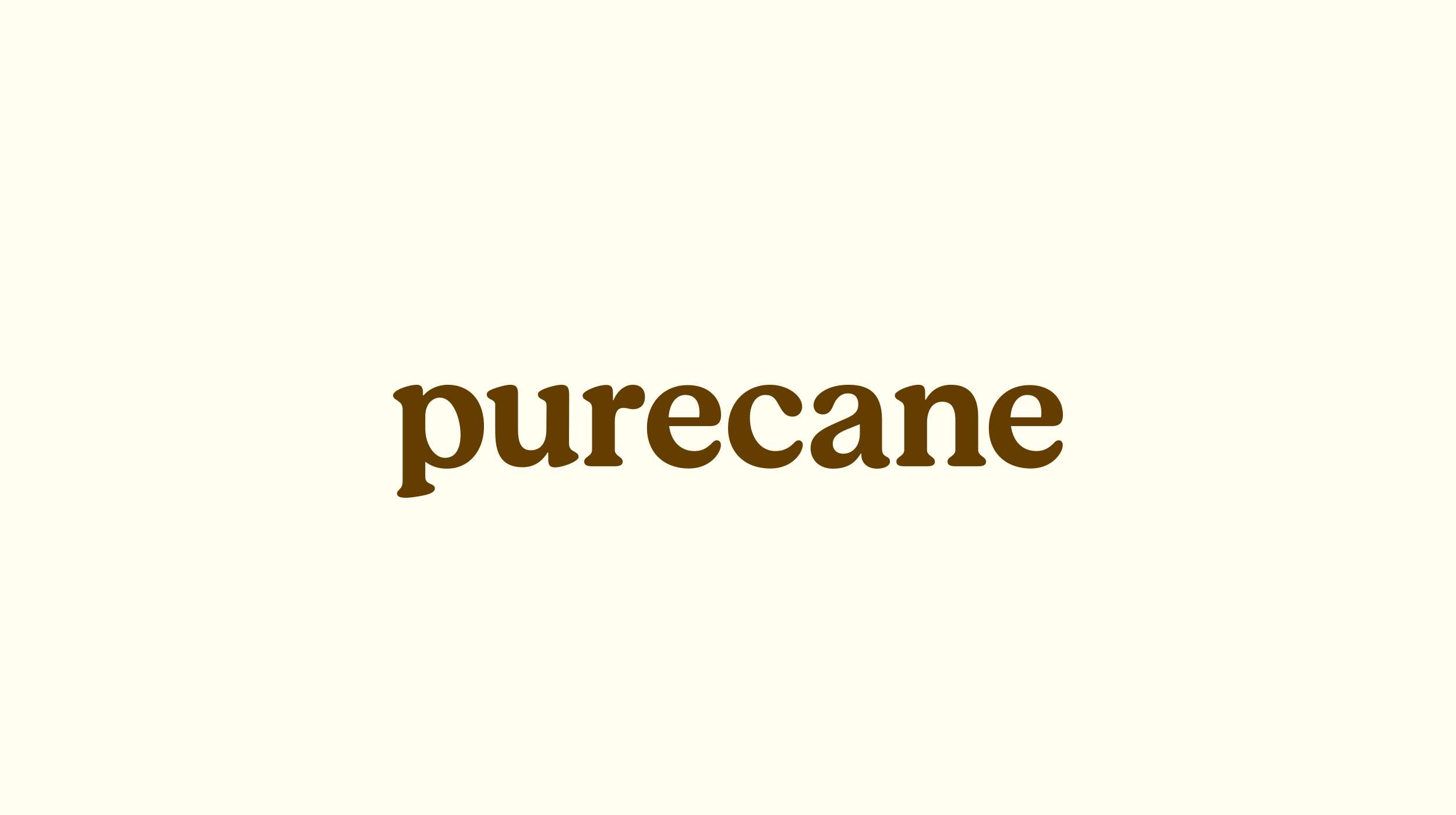
Imagine an all-natural sweetener fermented from sugarcane with zero calories and real sugar flavor. That is Purecane, a sugar substitute that performs like the real thing because, well, it’s the real thing.
We designed a clean wordmark and a simple color palette for Purecane to go across all SKUs and comms.
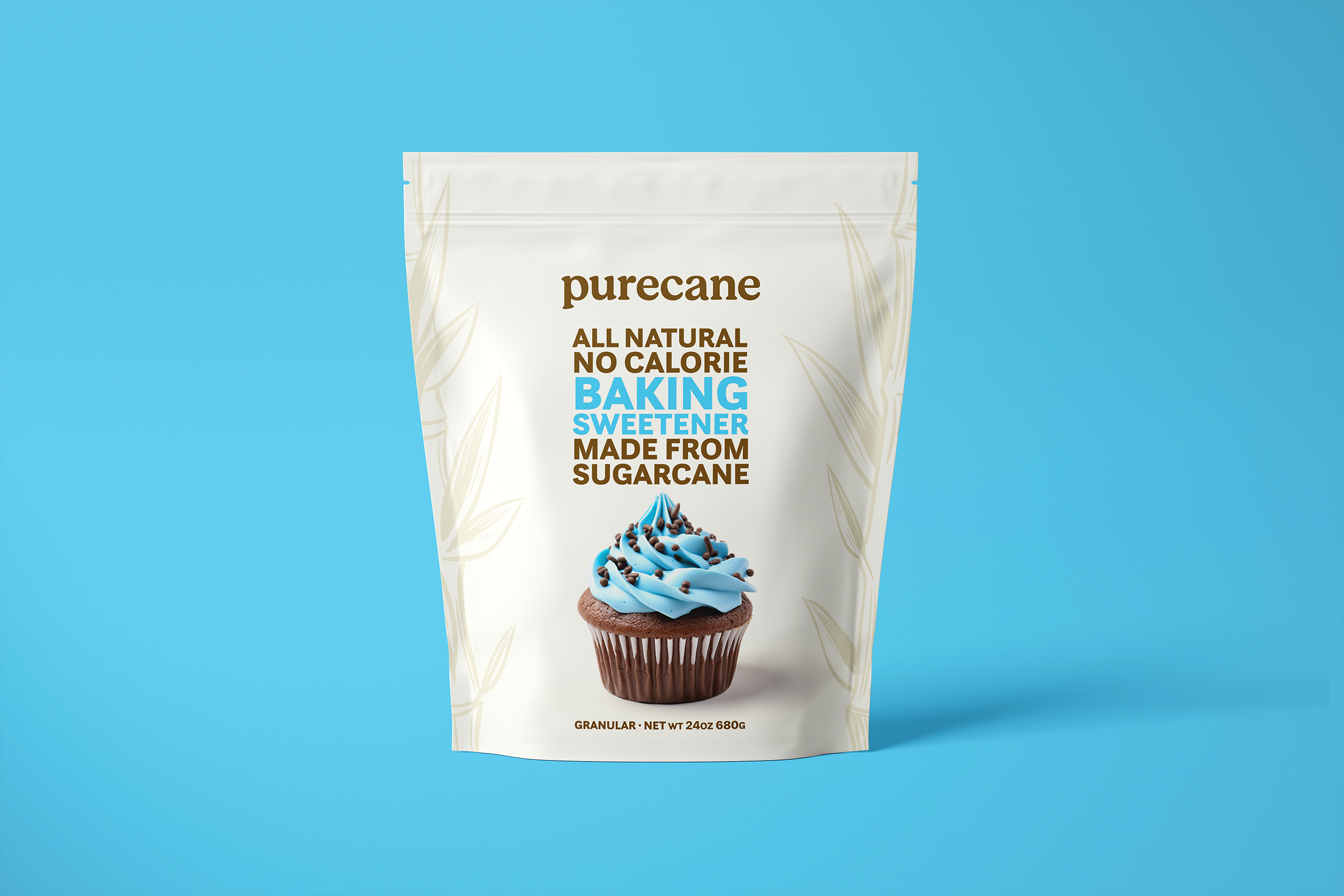
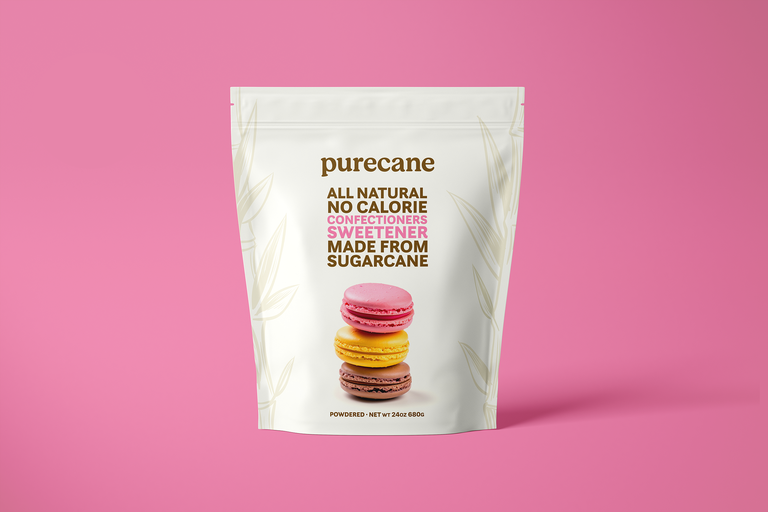
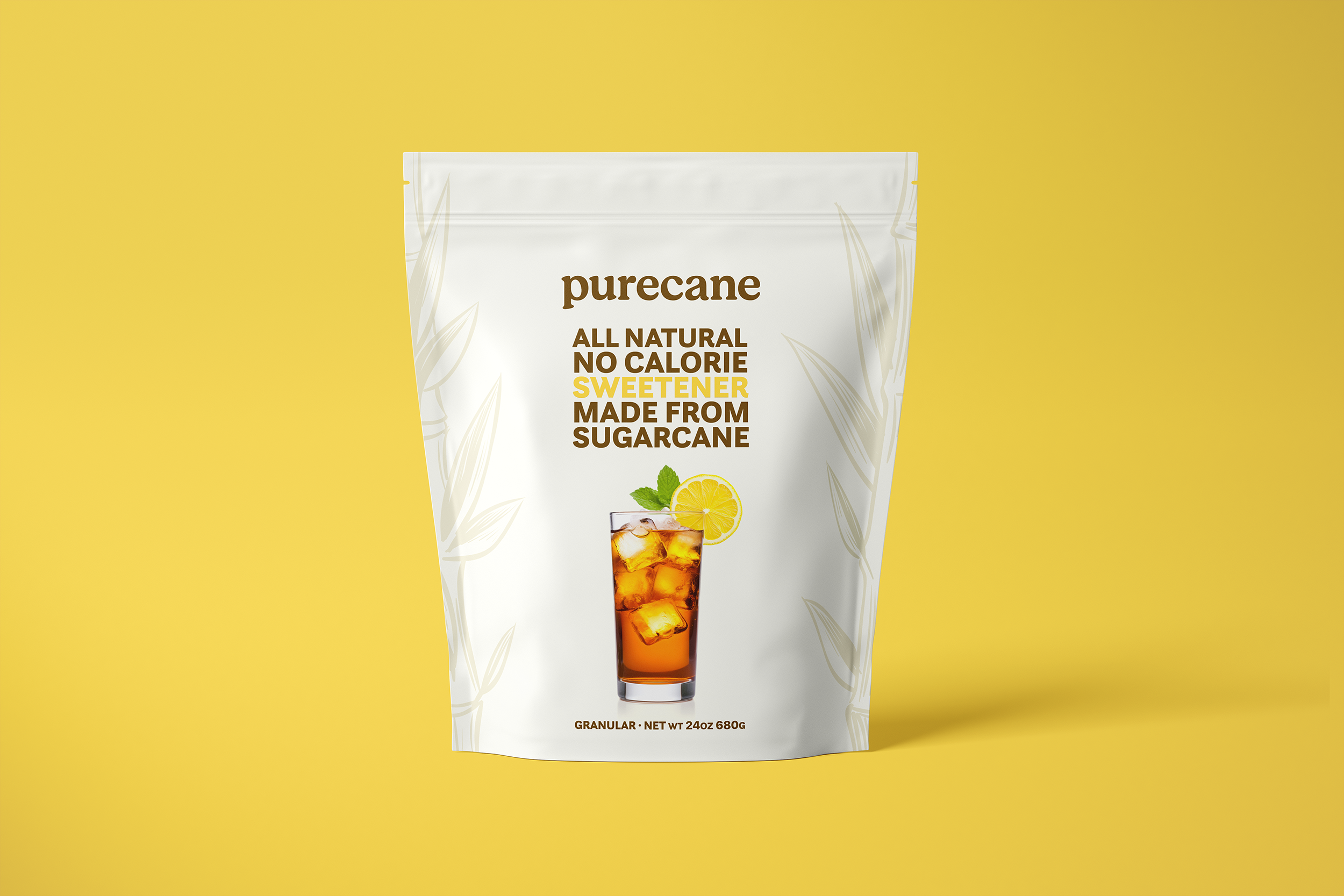
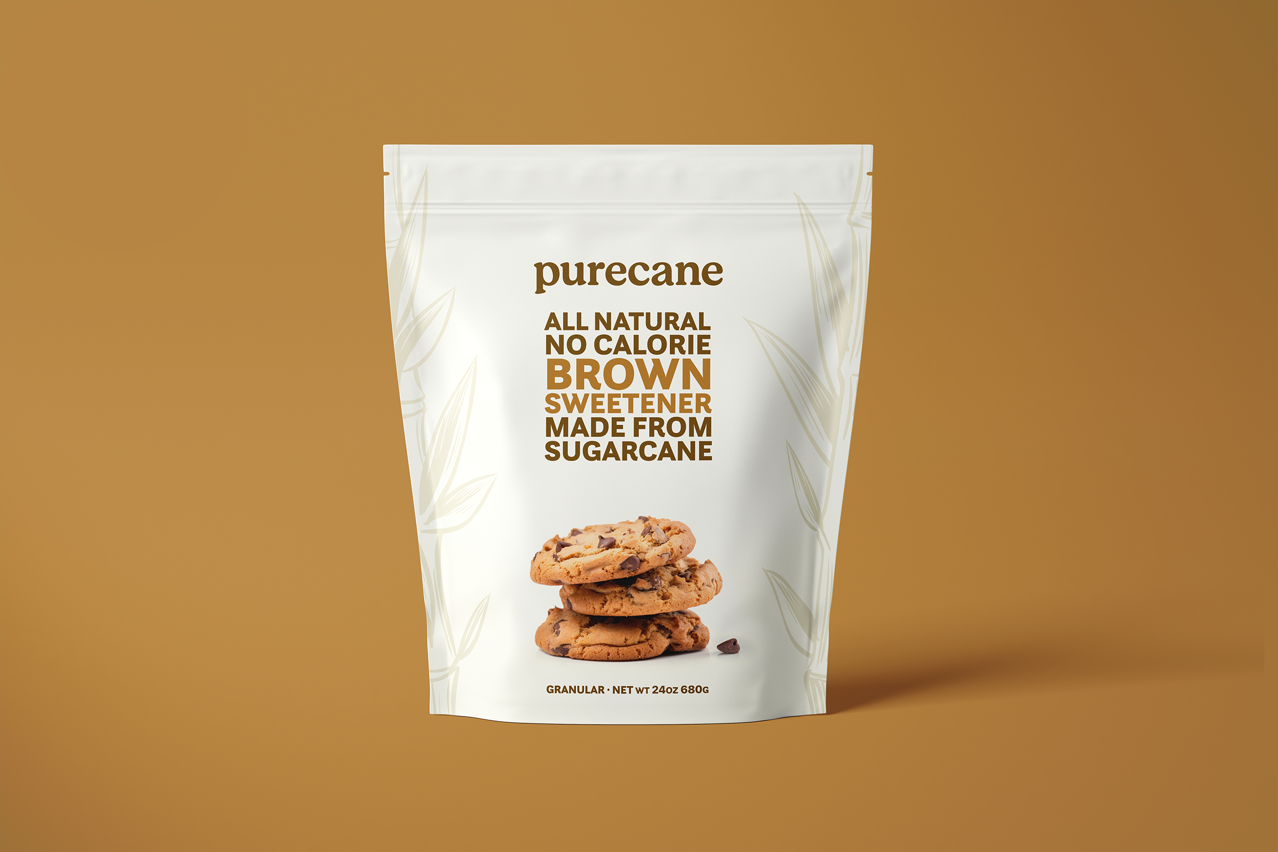
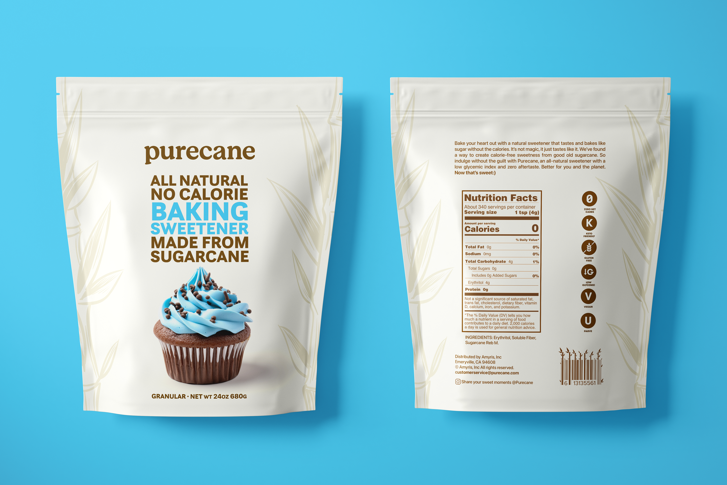
Purecane needed packaging that would stand out on the shelf from all the other not-so-natural offers on display. It was important that customers would get the sense of an all-natural product and could decode what each of the four products was for.
We opted for a clean packaging design with color-coded usage cues and easy-to-read, no-calorie messaging.

Selected Work

AxeSocial
Afterlife CollectionSocial

BoseSocial

Burger KingFilm

FordBrand Refresh, Film & Social

HeinekenFilm & Experiential

Guitar HeroFilm

GoogleFilm & Social

GoogleFilm & Social

Fahrrad.deDigital & Social

JoyBrand Design

FordBrand Refresh, Film & Social

Best BuySuperbowl
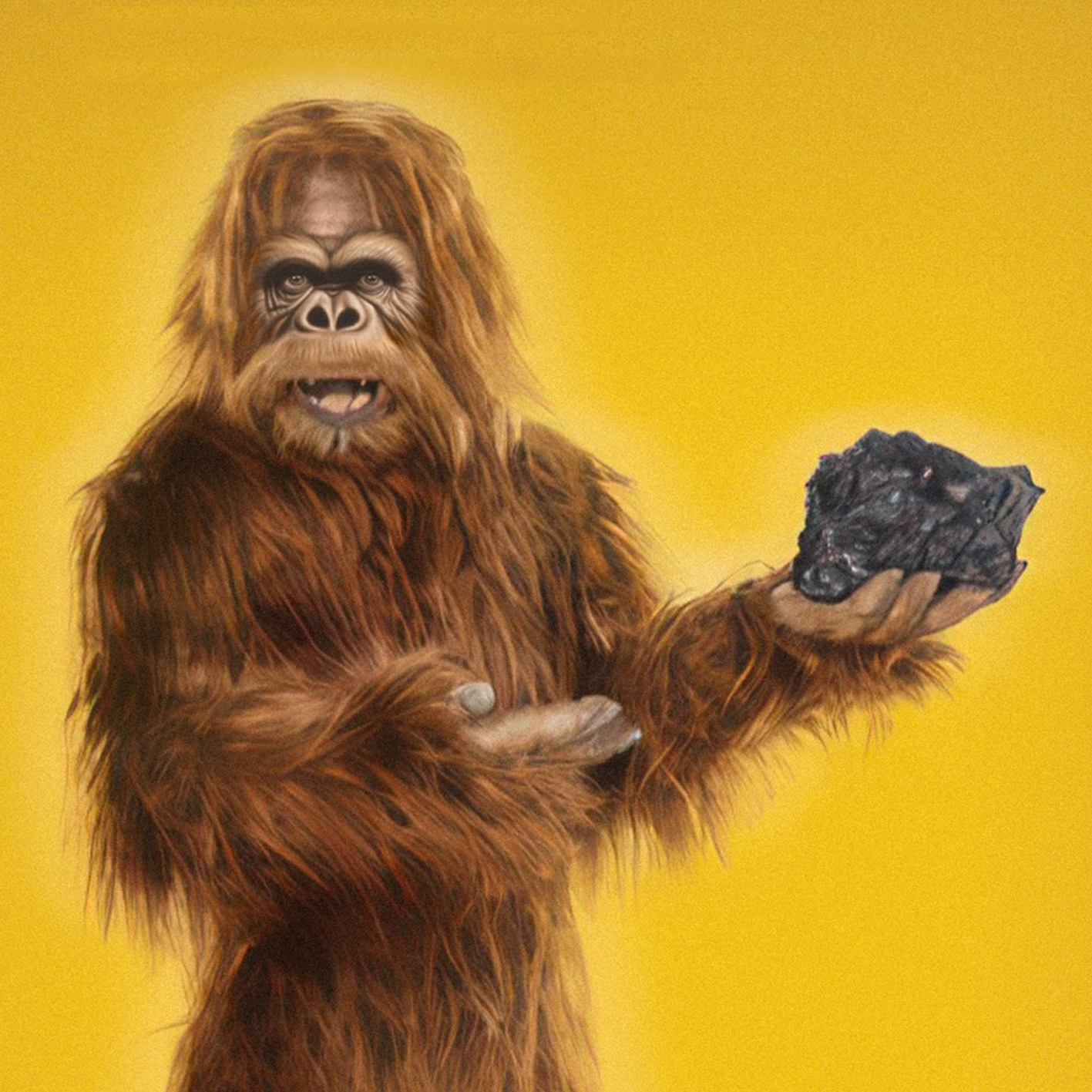
RealityOOH & Digital

PurecaneBrand Design
Don't Let NickelbackSocial
SupernovaProduct
